Design @McHacks
Leading the design team at McGill's largest hackathon, building a scalable design system and brand identity from the ground up.
- Role
- Design Lead
- Team Members
- Team of 4
- Project Length
- June 2025 - Present
- Tools
- Figma, Illustrator, Branding, Leonardo Color
What is McHacks?
McHacks is McGill's largest annual hackathon! Each January, more than 500 student programmers, designers, and developers come together to build projects that solve real-world challenges.
I've been part of the McHacks design team since June 2025 — starting as a Design Coordinator for McHacks 13, and now leading the design team as Design Lead for McHacks 14.
My Role: Design Lead
As Design Lead, I own the overall brand identity and visual direction for McHacks 14 — from establishing style guides and visual assets that stay consistent across every platform, to building out a brand-new design system in Figma with design tokens, reusable component libraries, and guidelines for scaling it going forward. I also illustrate original brand assets and visual identity elements in Illustrator and Figma, manage a team of designers, and coordinate closely with our marketing and sponsorship teams. On top of that, I oversee our web design projects, making sure layouts stay clean and easy for our developers to build from.
What About This Year?!
This year, I'm leading the design team at McHacks. We're currently gearing up for the 14th edition of the hackathon, taking place in January 2027.
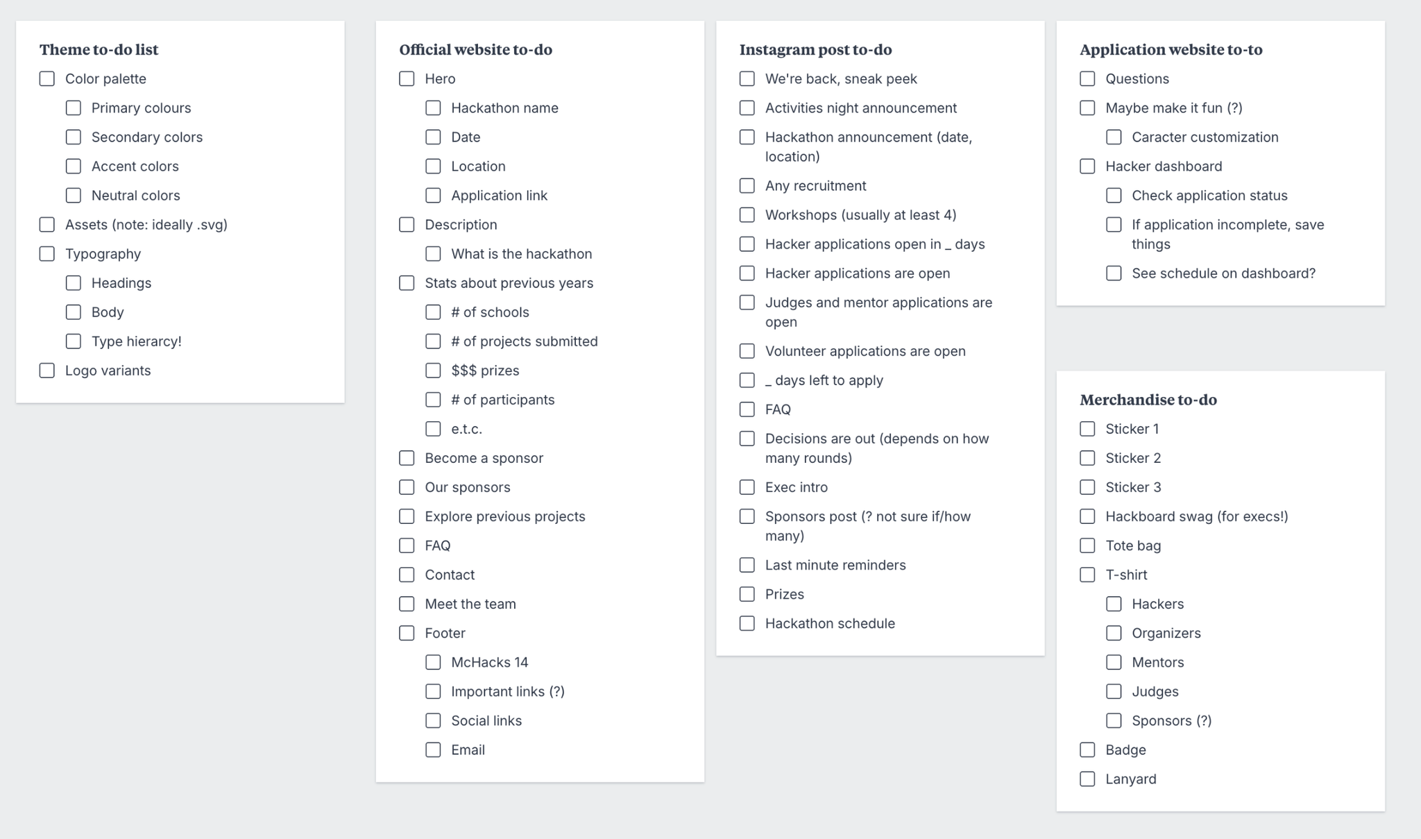
Brainstorming This Year's Theme
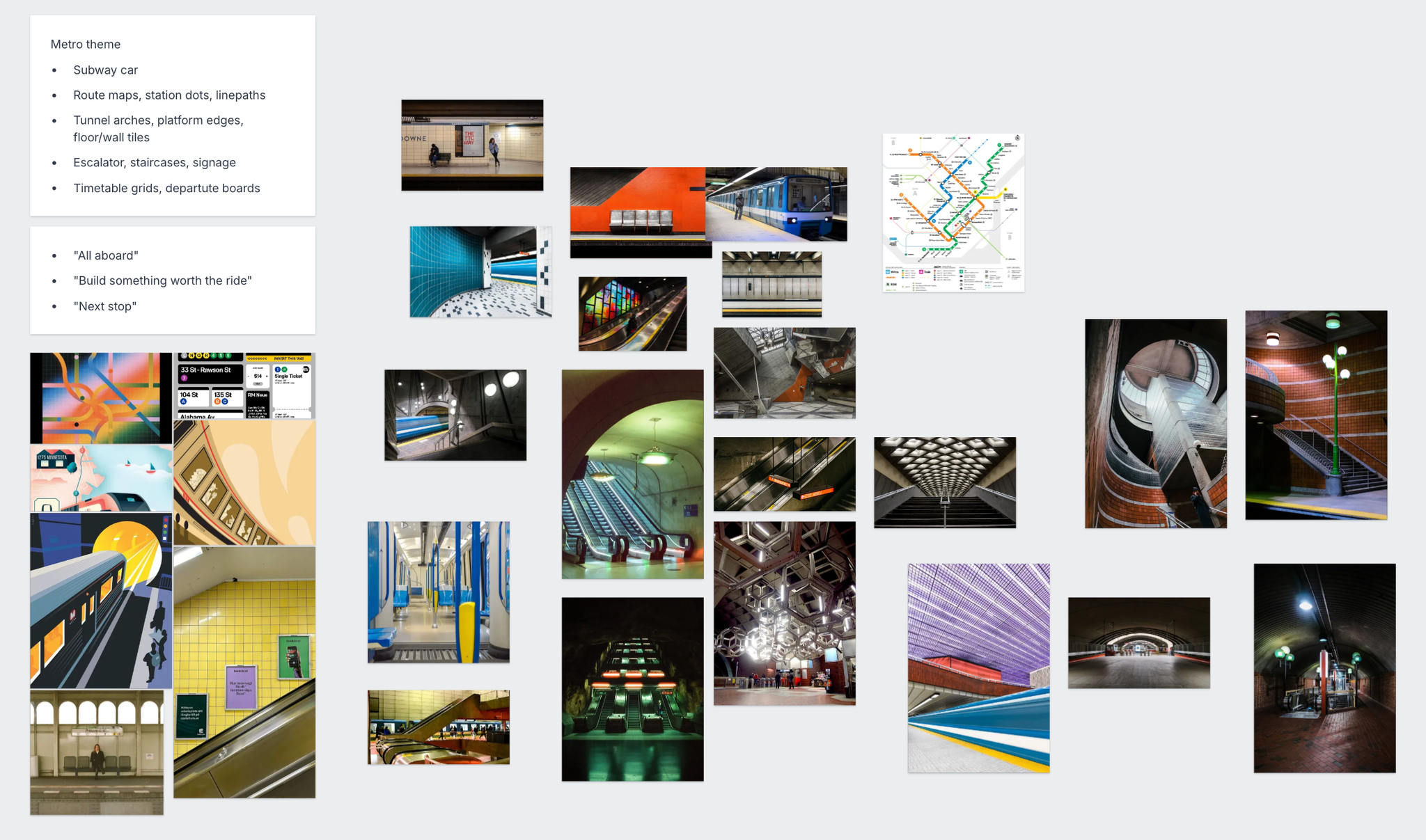
Each year, McHacks selects a unique theme, requiring a complete refresh of our branding and visual assets. After reviewing six options with the team leads, we chose a Montreal metro theme to convey the idea of embarking on a journey and inviting attendees to "hop on board!"
The Design System
Last year, McHacks operated without a formal design system, making it difficult to maintain visual consistency across our assets — every graphic felt like starting from scratch. Experiencing that friction firsthand is exactly why I stepped up to build our first centralized design system this year, ensuring our future work is scalable and cohesive.
Here's how I approached Phase 1 of establishing our core visual architecture:
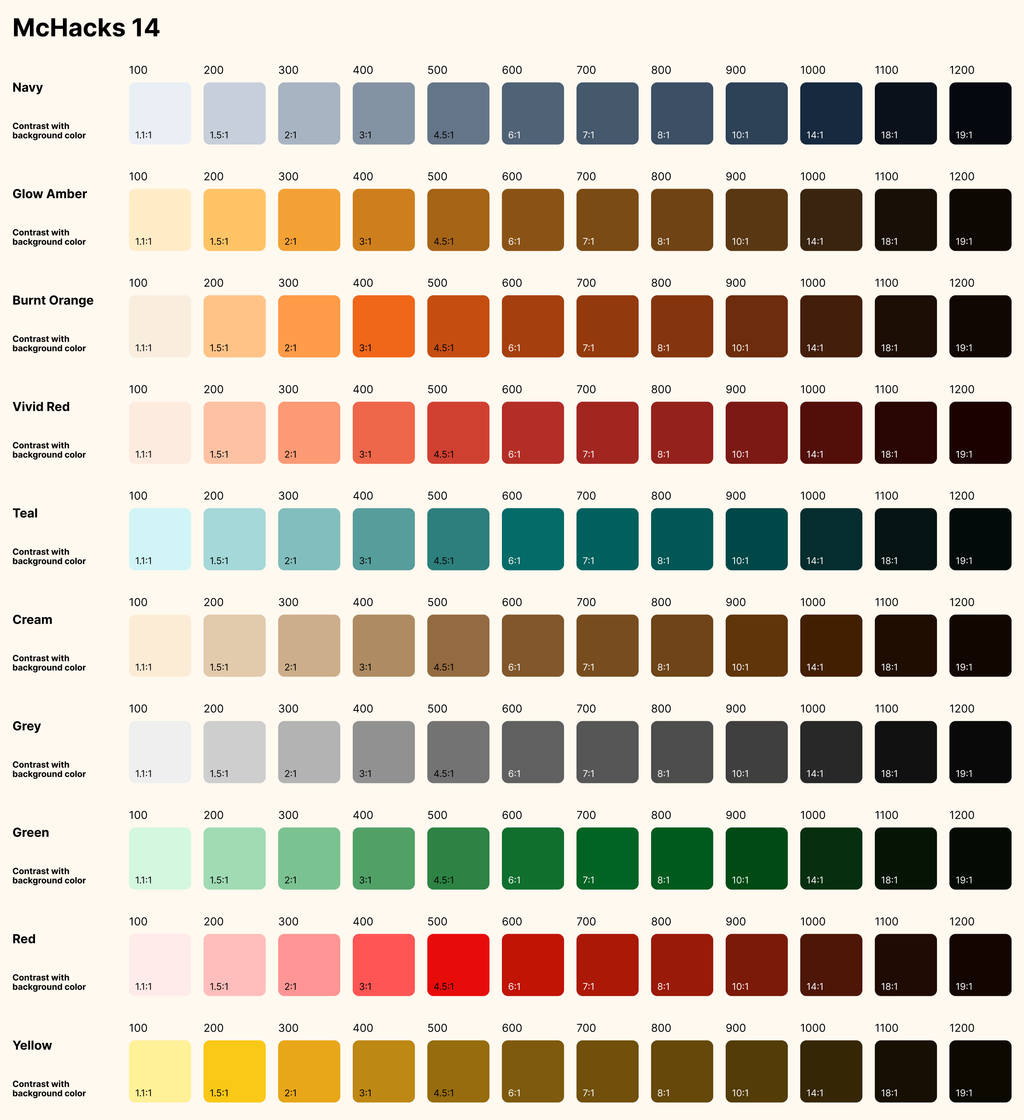
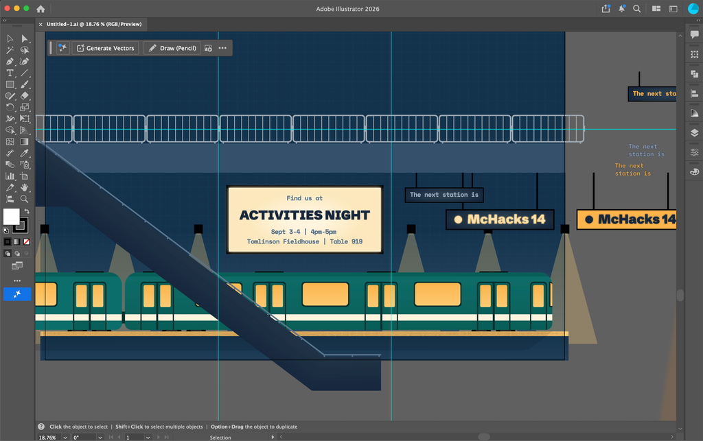
Visual Exploration & Stress-Testing
I began by brainstorming versatile color palettes and highly legible typography. Instead of choosing colors in a vacuum, I created sample assets to stress-test how these foundational choices would behave across both social media graphics and website UIs, ensuring they were flexible enough for all our contexts.
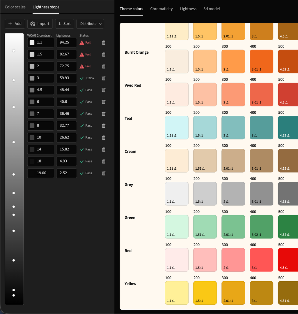
Algorithmic Color & WCAG Compliance
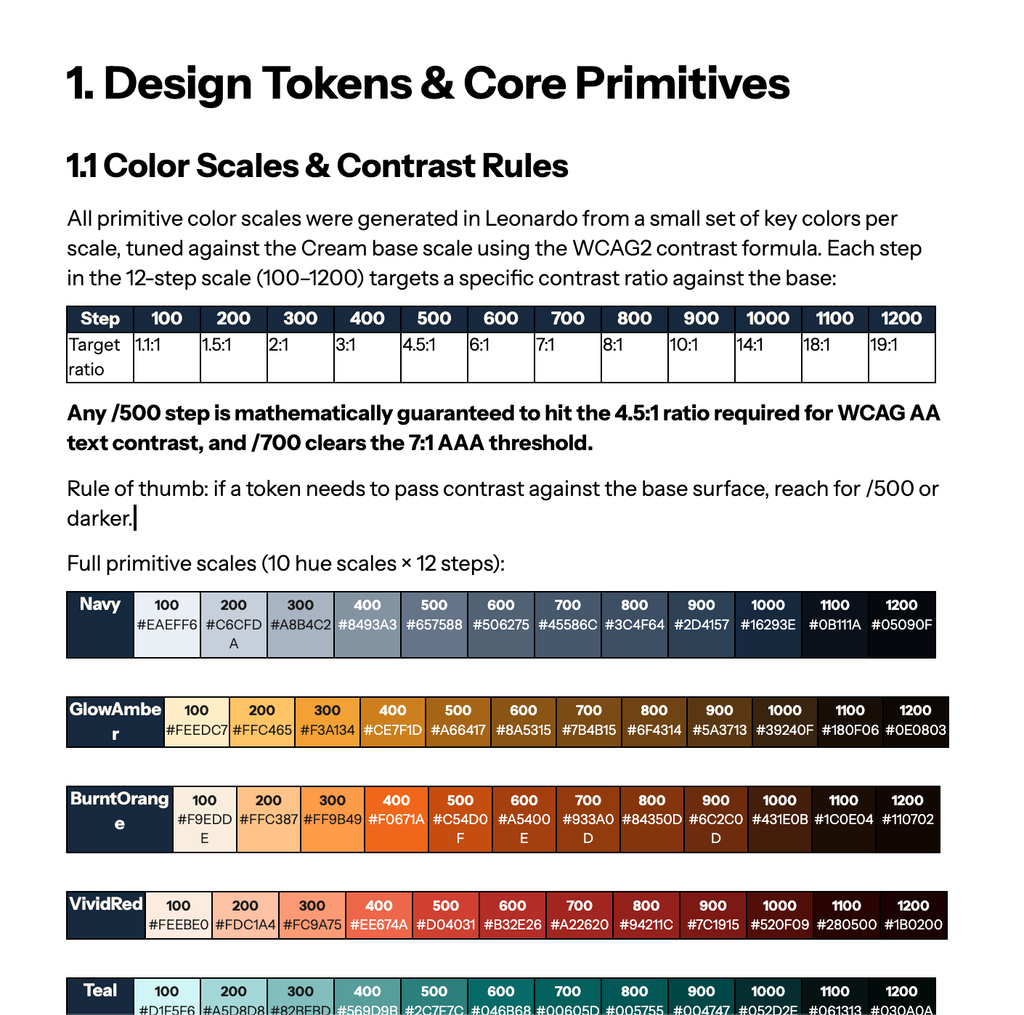
Making the hackathon accessible to everyone is my top priority. To achieve this, I used Leonardo Color to generate algorithmic colour scales with calculated steps based on different background states. This guaranteed that our entire palette inherently meets WCAG contrast requirements, baking inclusivity directly into the system.
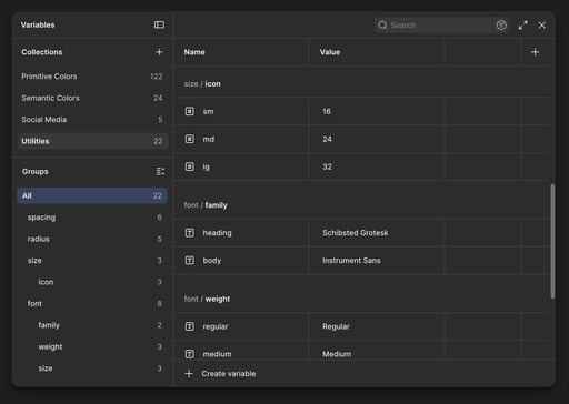
Variable Architecture in Figma
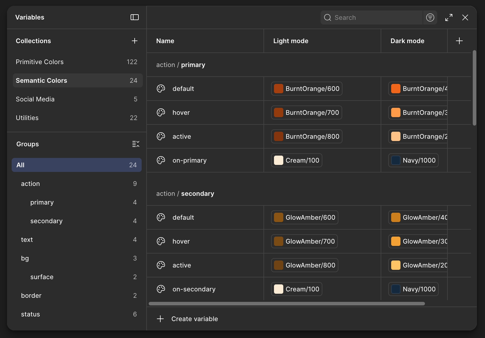
Rather than hardcoding hex codes, I established a token architecture in Figma using a 3-tier variable system to make future theme switching seamless:
- Primitives — the raw colour values and base scales
- Semantics — contextual tokens (e.g., action-primary, text-disabled) that define exactly where and how a colour is used
- Utilities — mathematical scales for typography, spacing, and sizing to maintain a consistent grid across the product
Documentation & Next Steps
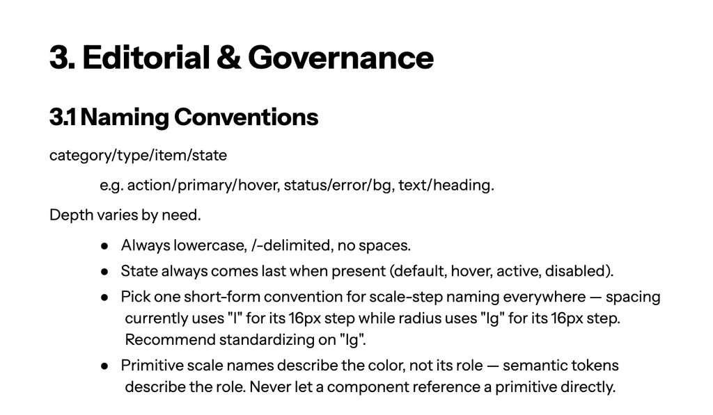
I'm now drafting documentation outlining the logic and usage rules for these tokens. With the foundational variables and documentation in place, my next step is collaborating with the web team to lock in the final brand direction before we move into building the actual component library.
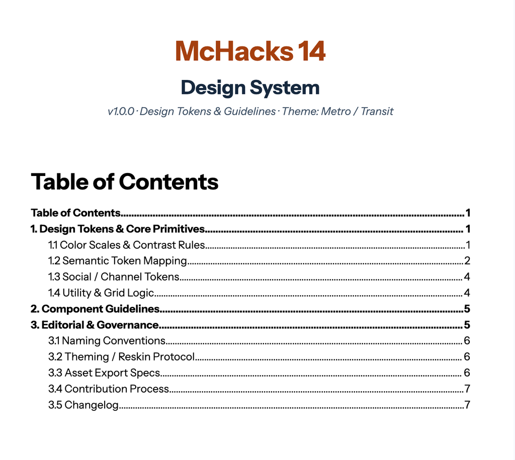
This year's work is still in progress — I'll keep this updated as McHacks 14 comes together.
My Role: Design Coordinator
As Design Coordinator, I worked alongside a team of four to shape McHacks 13's visual identity and digital presence. Day to day, that meant designing branded digital assets and presentation templates in Figma, applying consistent layout systems to keep everything on-brand. Because we were often working against tight, deadline-driven timelines, I got comfortable iterating quickly — taking feedback from teammates and cross-functional stakeholders and turning it around fast without losing visual consistency across social platforms and physical merchandise.
The timeline
June - July: Planning
To prepare for the upcoming hackathon, we brainstormed our vision for McHacks 13. This included developing the event theme, color palette, and visual assets.
September - December: McHacks 13 Announcement
This is when our team gets everything ready for the public eye! During this stage, my responsibilities included:
- Designing the tote bags that we will be giving to all the attendees
- Creating visual assets for use across our social media platforms
- Creating the social media graphics
January 17 - January 18: Hackathon Day
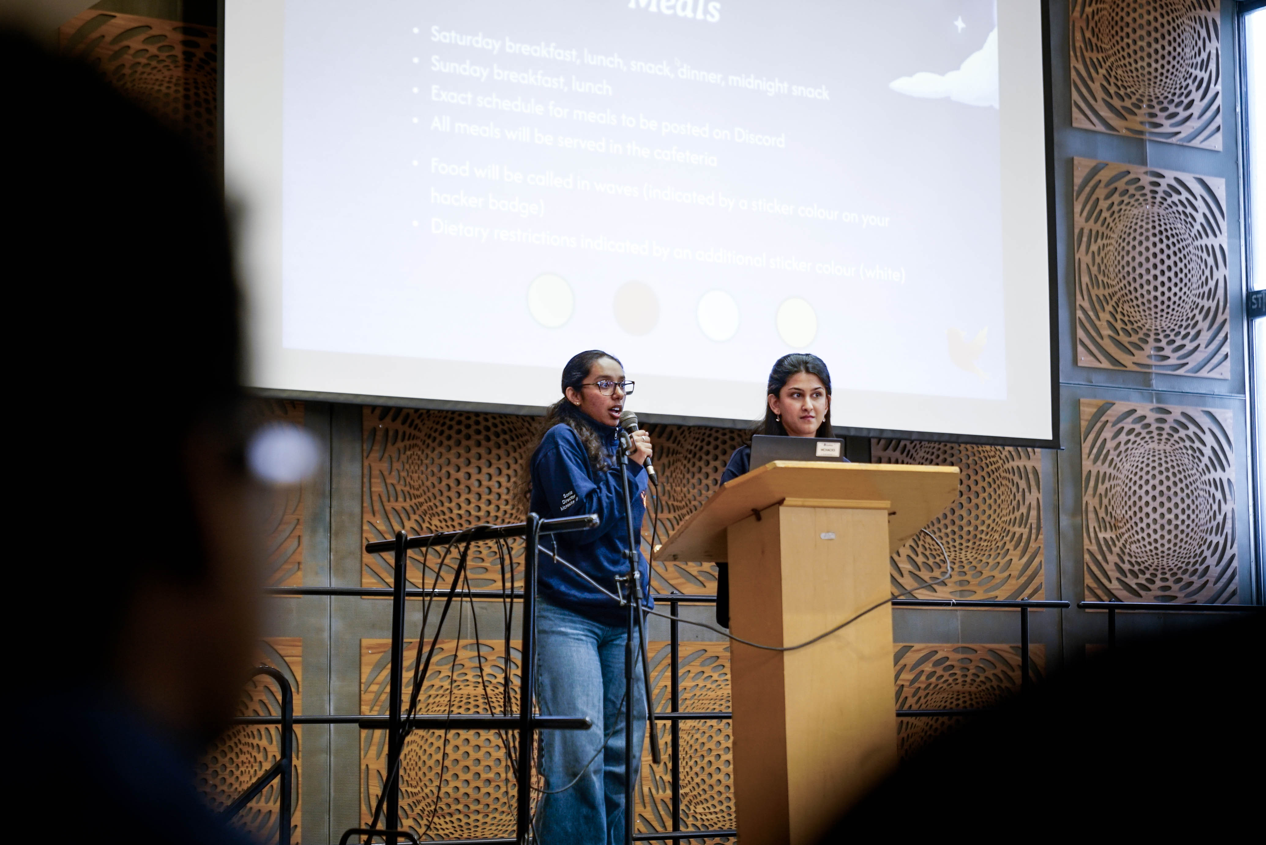
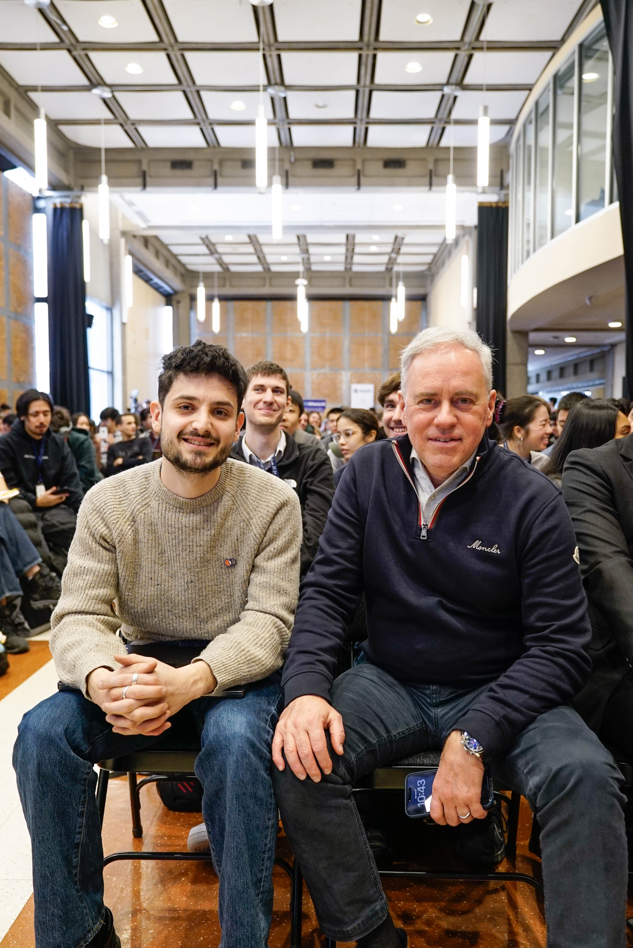
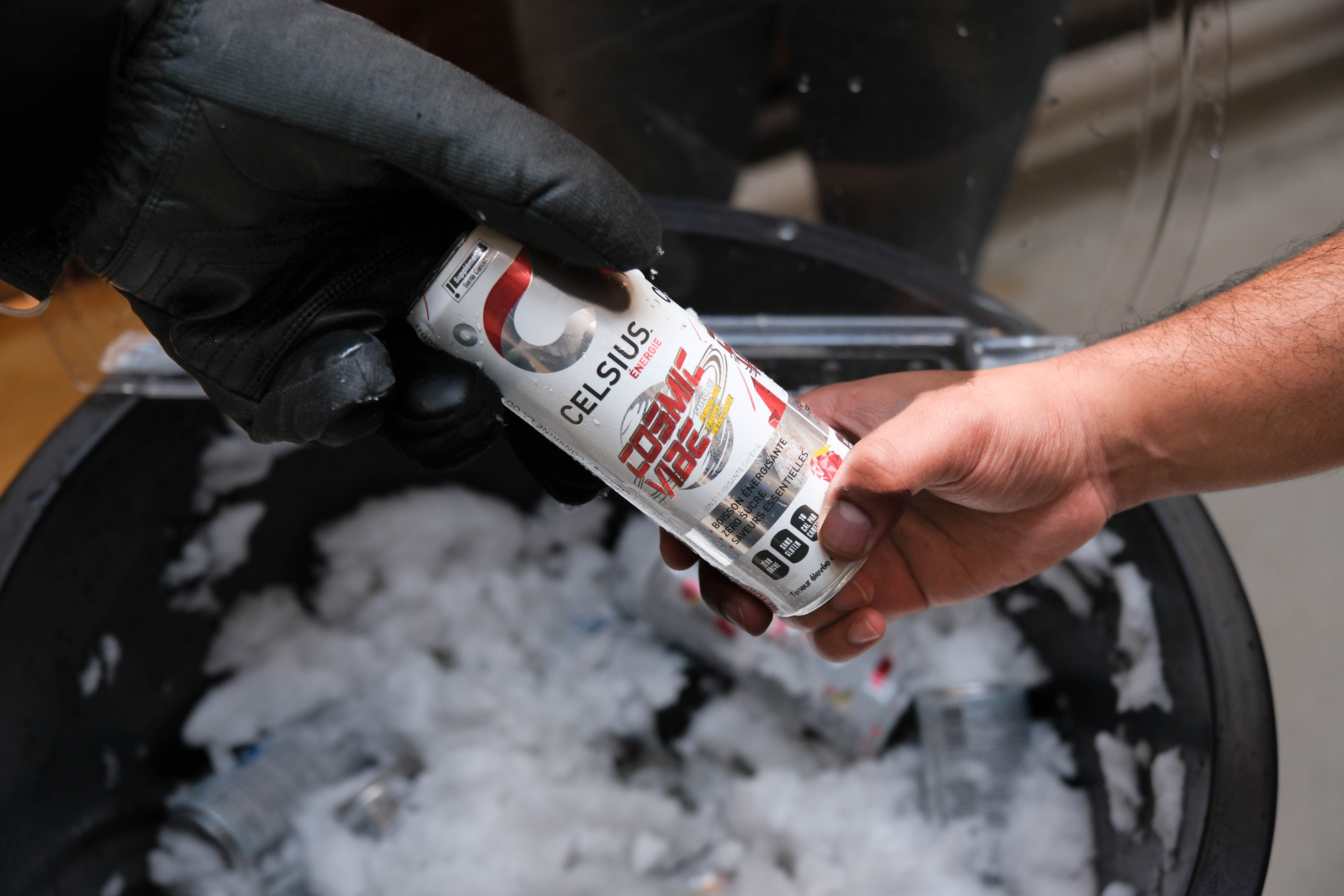
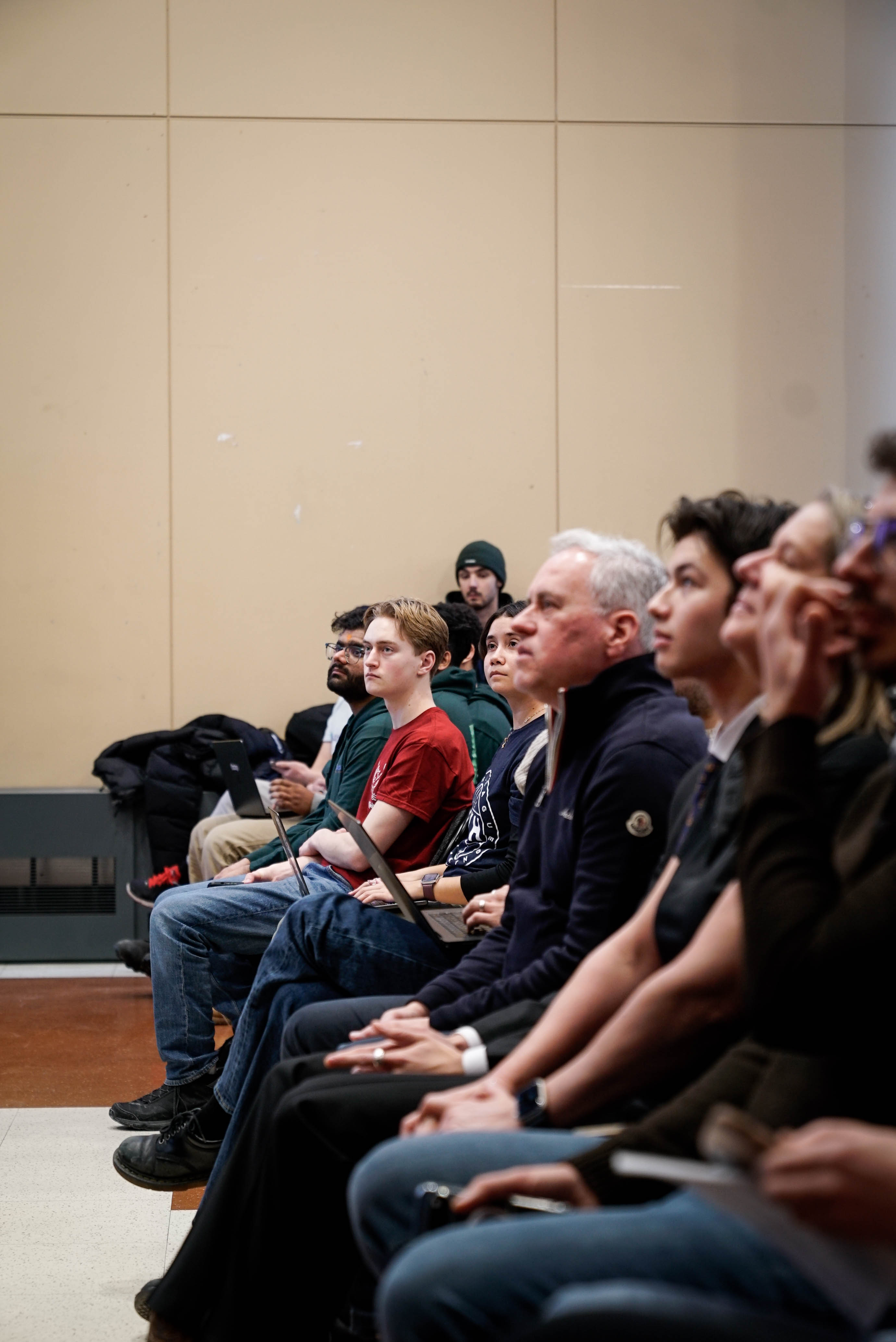
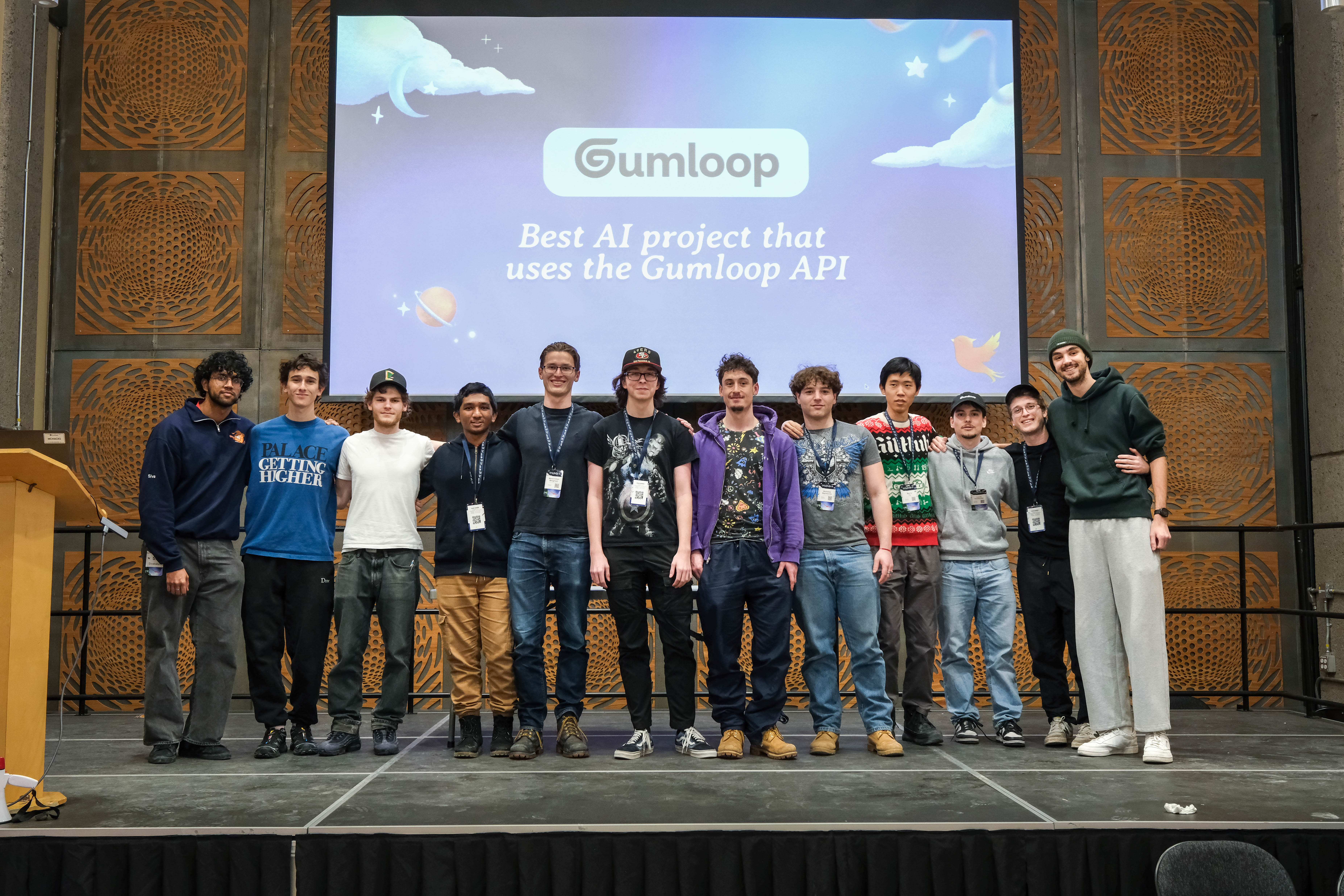
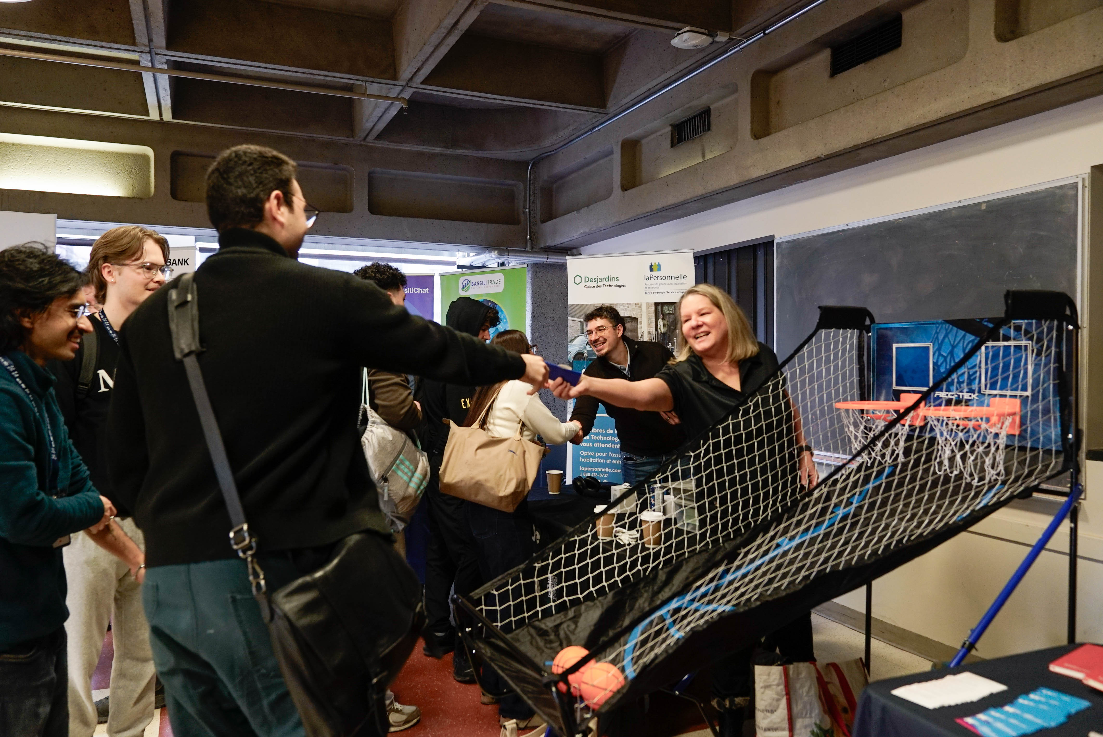
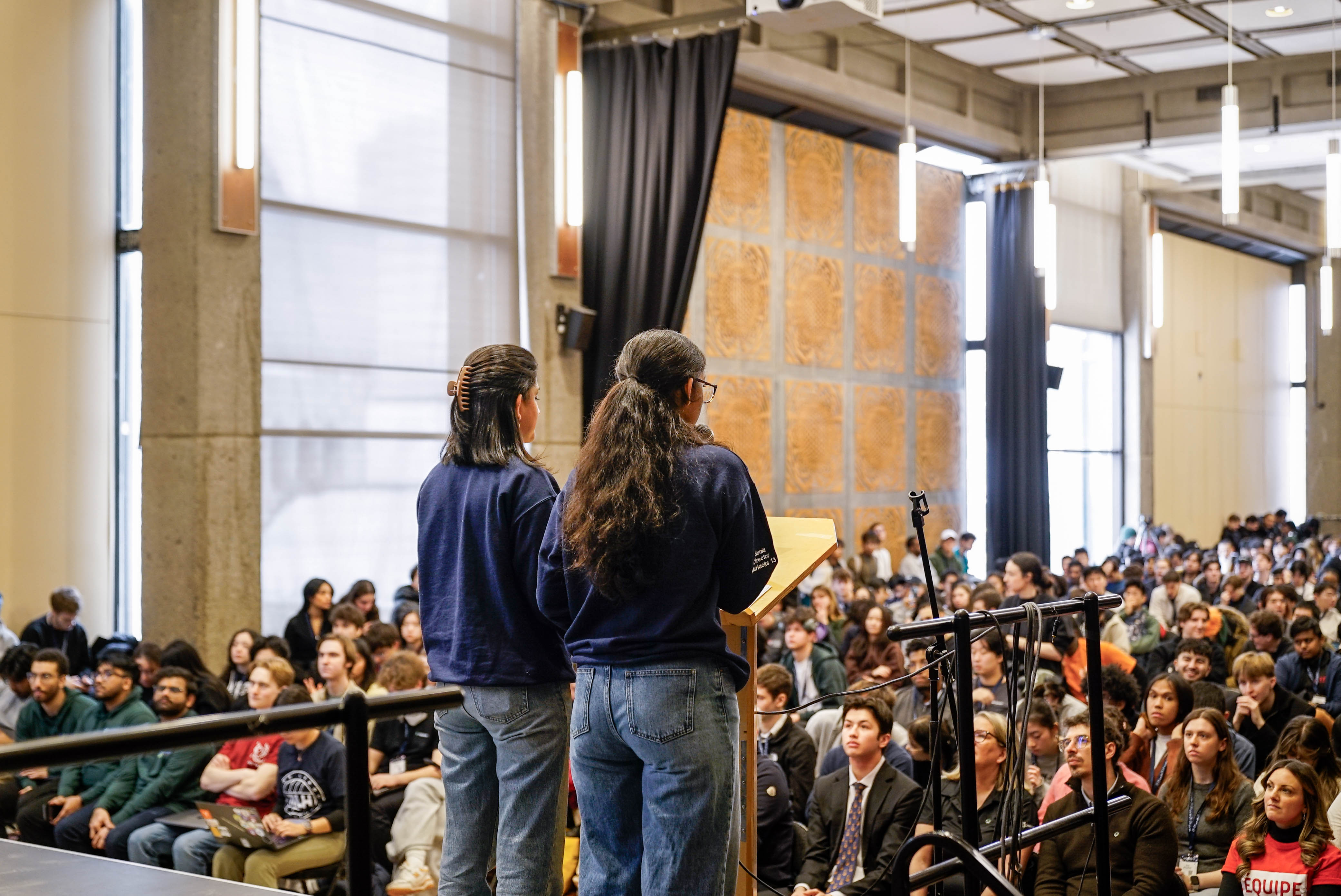
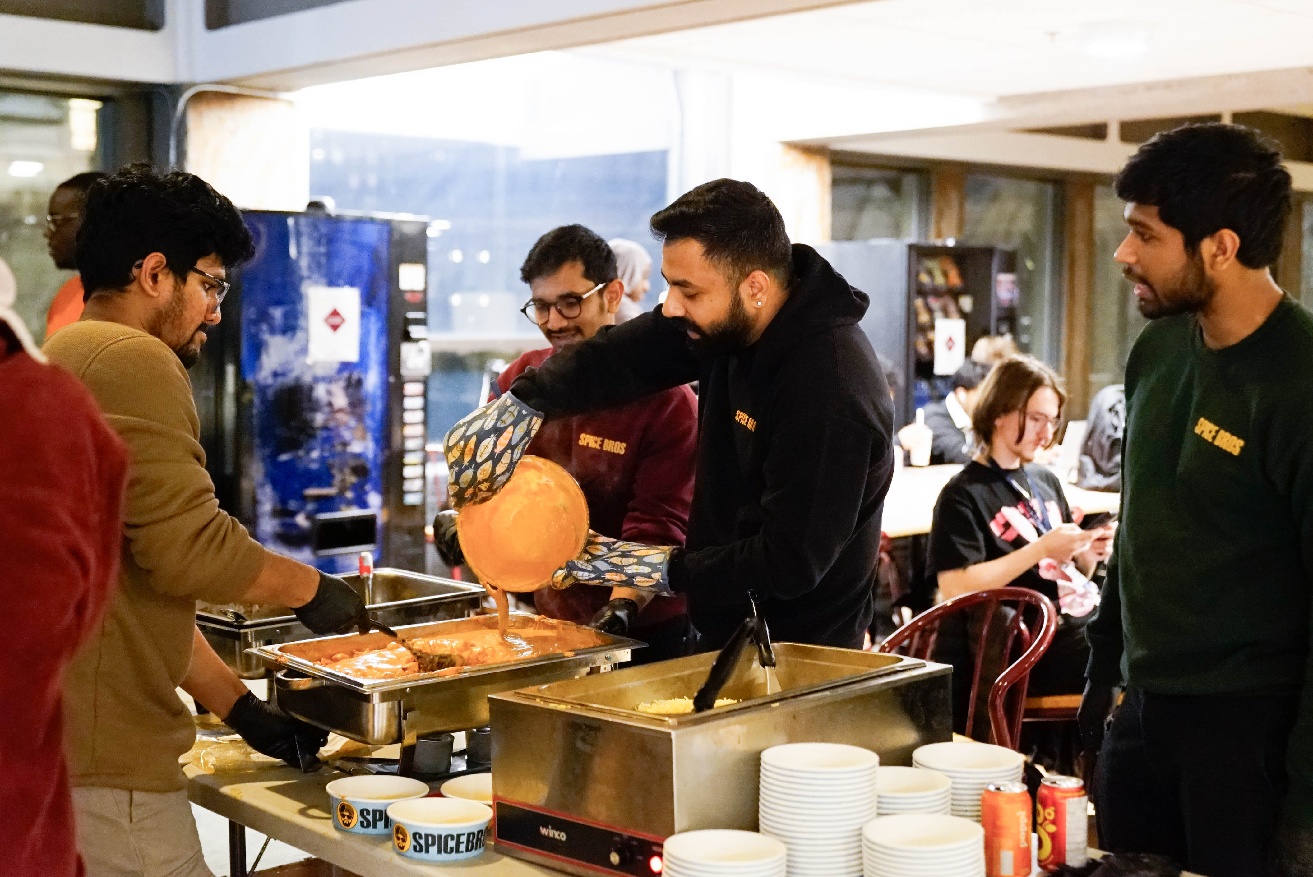
On these dates, I was onsite for 23 hours updating our opening and closing ceremony presentations and photographing the event.
Tote bag designs
My Goal: For the McHacks tote bag, my goal was to align with the visual theme of our website. The site was divided into three sections (sky, forest, and village) that, together, create a whimsical, magical atmosphere.
We aimed for all merchandise to reflect this overarching theme while allowing each item to maintain its own artistic identity. For the tote bag, I chose an illustrative style with fine line work to create a design that felt both contemporary and elegant.
Throughout the process, I also accounted for production and printing constraints to ensure the designs are feasible at scale.
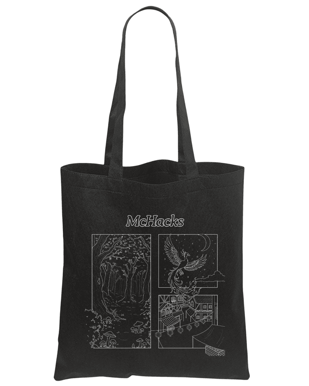
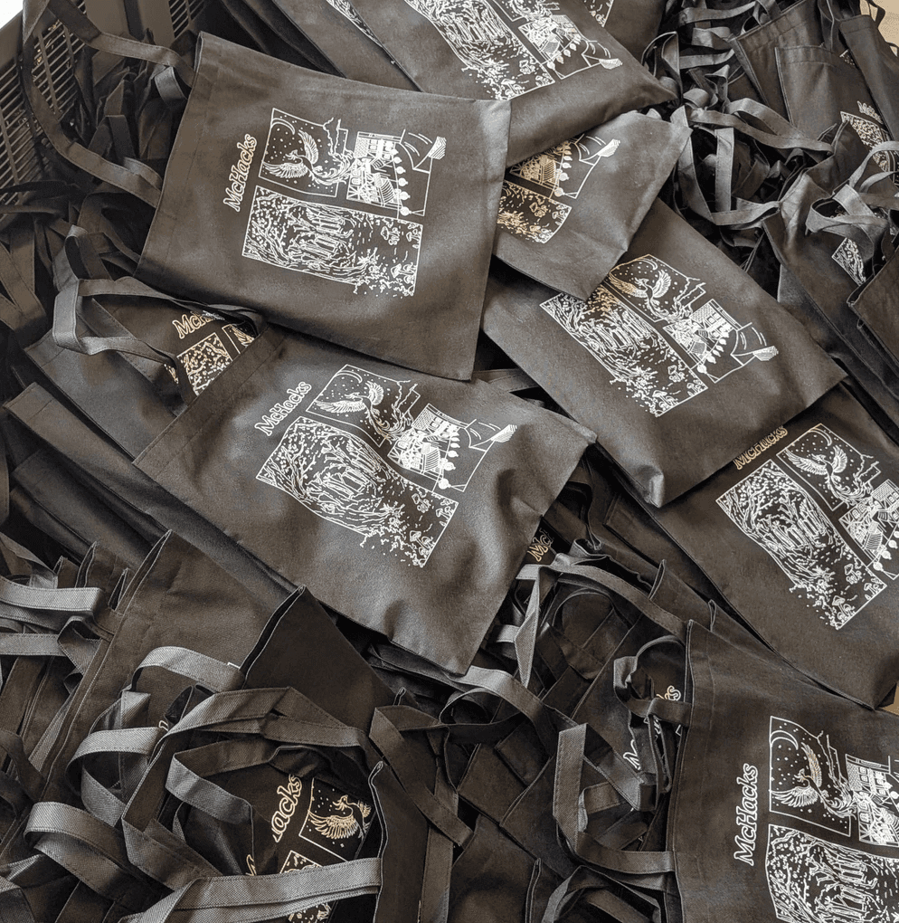
Some challenges: Due to an unexpected change in leadership, responsibilities were not clearly delegated as the deadline approached. I took initiative to own the tote bag design end-to-end, stepping into the role despite having no prior experience in digital illustration. I quickly learned the necessary tools and techniques, delivering a final design on time that aligned with the event's branding and production requirements.
Creating social media graphics
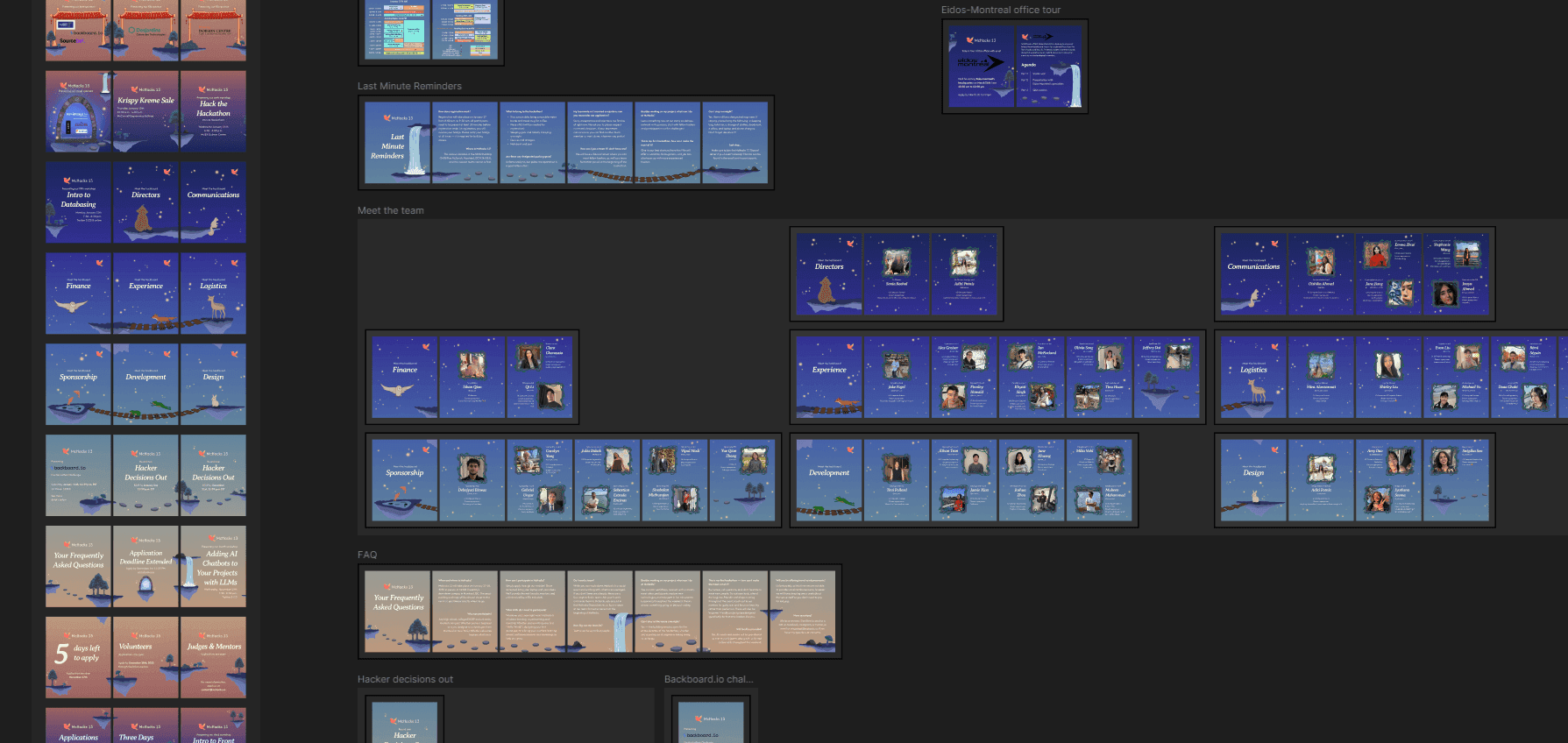
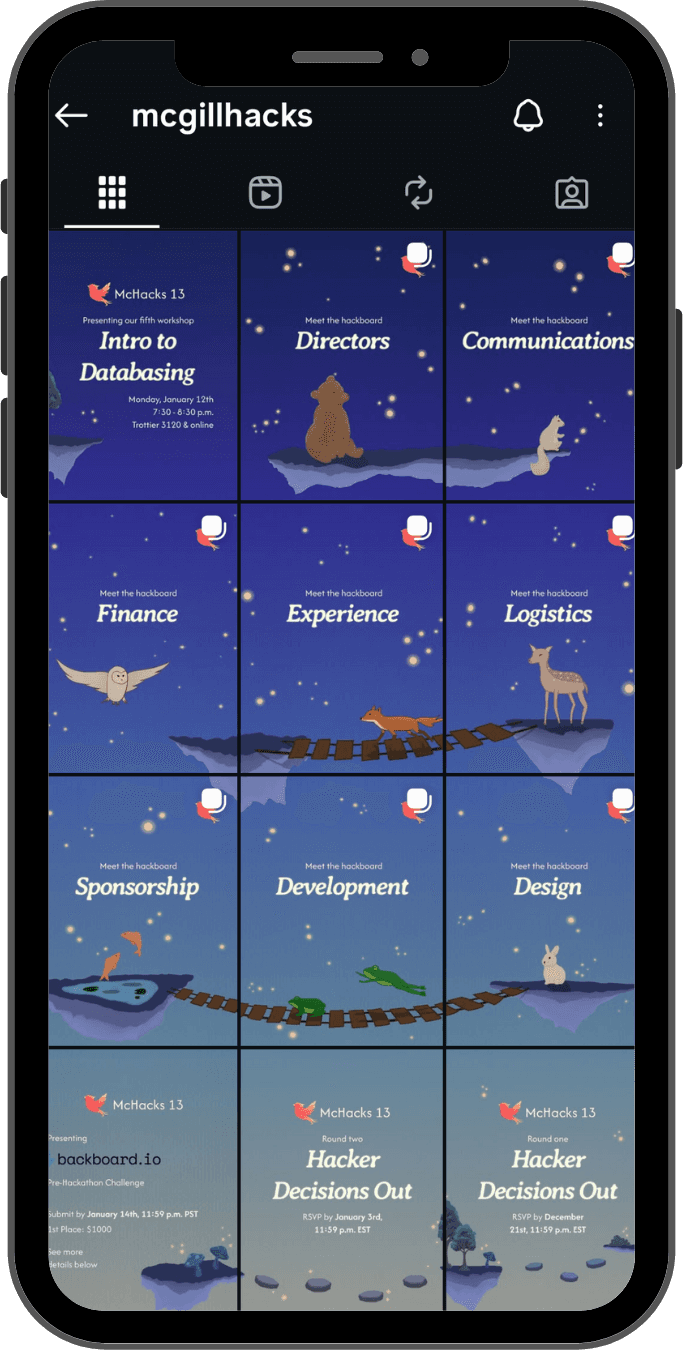
For this year's Instagram presence, my goal was to ensure that each post felt cohesive while still maintaining its own unique identity. To achieve this, I planned the backgrounds and visual assets in advance so that the posts would align stylistically and flow seamlessly across the grid.
Creating the posts involved close collaboration with the Communications team, who provided ongoing requests for social content. This required adapting quickly, coordinating details, and meeting tight deadlines to keep everything on schedule.
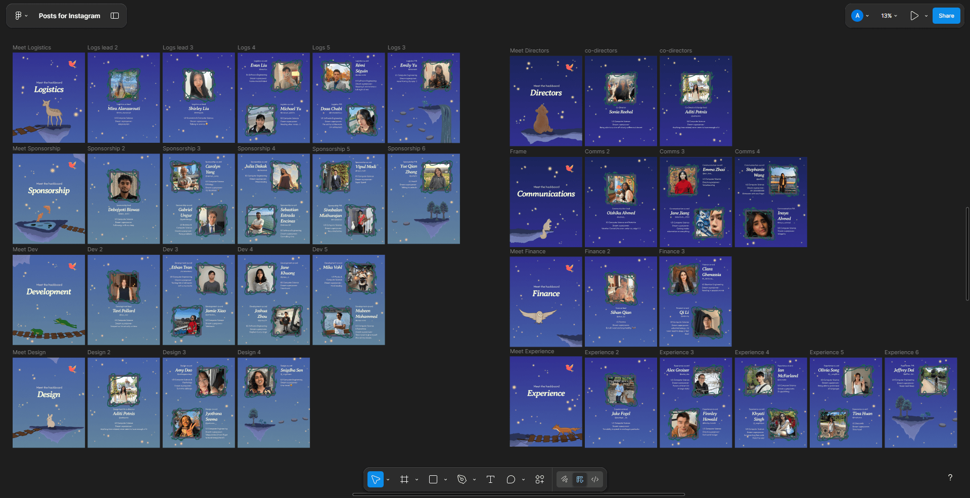
Our "Meet the Team" posts were among our most complex and detailed, and I was responsible for illustrating and designing them, including:
- Producing high-quality illustrations under a tight deadline
- Revising and rearranging illustrations on the fly due to last-minute workshop announcements that needed to be posted first, while ensuring all visuals remained cohesive and connected
- Quickly updating content and visuals based on feedback to meet changing requirements
Revising opening and closing ceremony presentation
As the sole design team member present throughout the entire event, I took full ownership of refining and finalizing all presentation materials to ensure a polished, professional experience for participants and sponsors. Under significant time constraints, I:
- Executed rapid, last-minute design revisions to resolve inconsistencies and improve clarity
- Standardized branding across all decks and visual assets (fonts, colors, layouts) to deliver a cohesive visual identity
- Worked closely with co-directors to align presentations with event goals and messaging
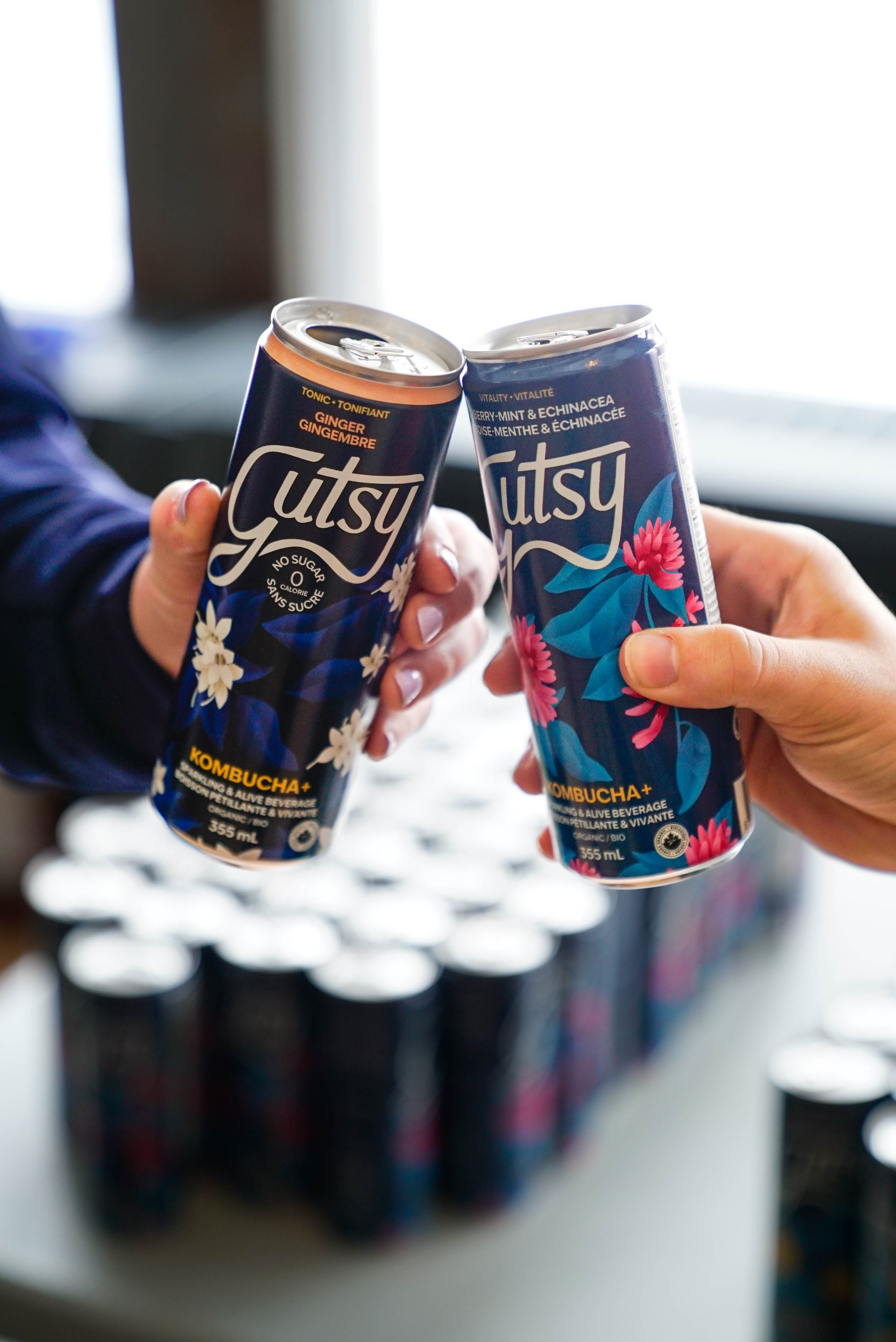
In addition, I documented the event through photography, managing multiple responsibilities simultaneously to support both the event's execution and post-event communications.
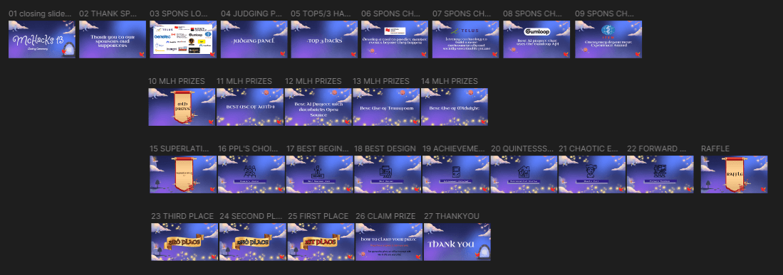
Before my revisions, I identified several concerns with the previous slideshows and worked with the co-directors to make improvements:
- Fonts are inconsistent and do not align with our branding, differing from those used on our website and social media.
- Some text lacks sufficient contrast with the website background, creating accessibility issues.
- Certain assets do not align with our branding.
- Assets are not consistently placed, resulting in off-centered or misaligned elements.
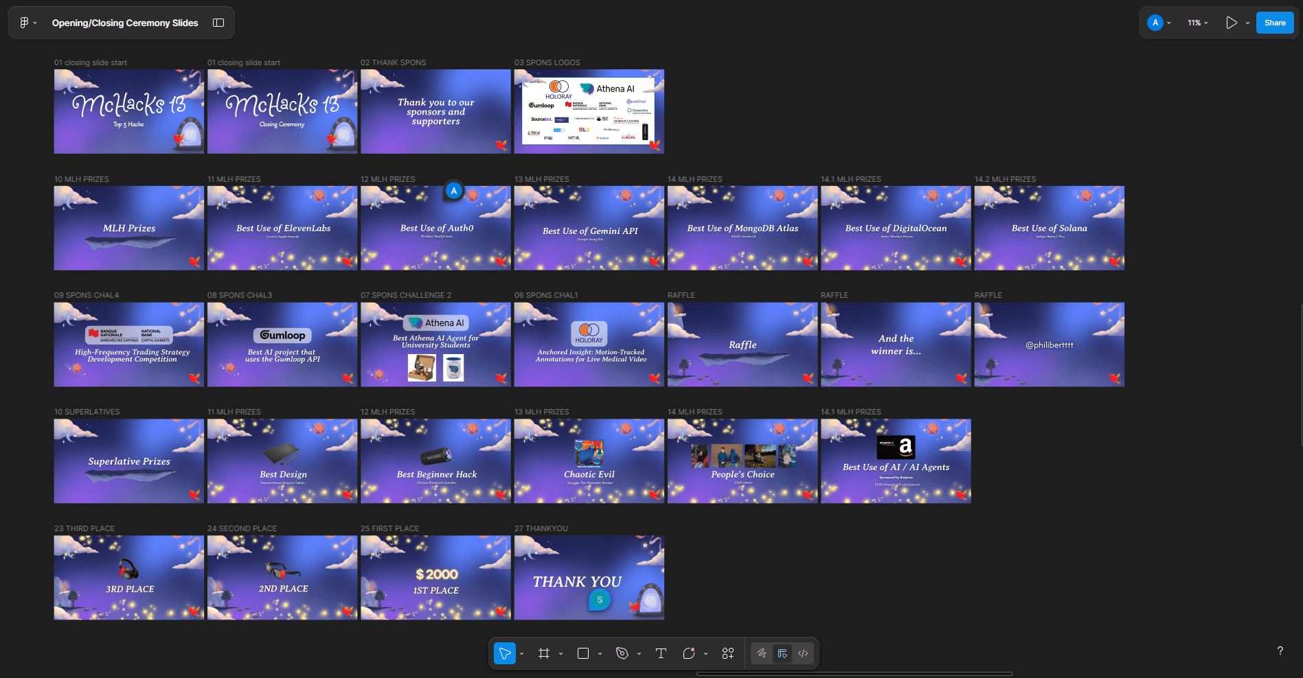
After my revisions:
- Applied the correct sponsor logos, resizing and repositioning them to reflect their sponsorship tiers.
- Updated fonts, assets, and colors to align with our branding.
- Ensured all assets were legible and accessible.
- Aligned all assets correctly to maintain visual consistency.
Photography