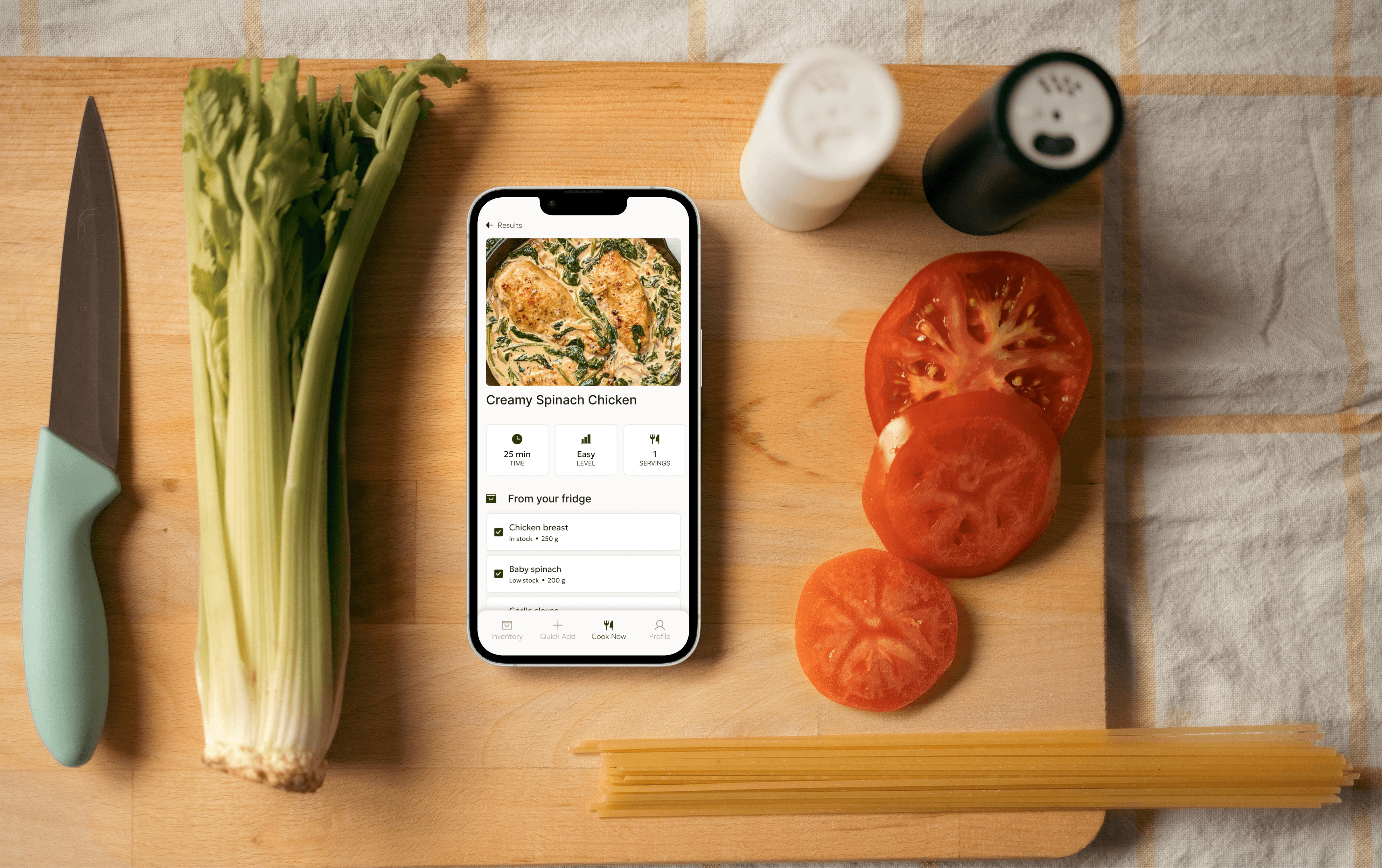
Fridge Friend
A mobile-first kitchen assistant that reduces student food waste through inventory tracking and recipe integration.
- Role
- UI/UX Designer
- Team Members
- Team of 4
- Project Length
- 36 hours + 8 hours
- Tools
- Figma, Product design
Fridge Friend started as a 36-hour hackathon challenge in 2024. Fourteen months later, I've revisited the project to bridge the gap between our original "sprint" vision and the more polished, user-centric design.
Overview
Fridge Friend is a kitchen management application designed to bridge the gap between grocery shopping and meal preparation for first-time independent dwellers. The goal is to provide a "smart assistant" experience that mitigates food waste by tracking ingredient lifespans and offering actionable cooking solutions. By centralizing inventory tracking and recipe discovery, the app aims to reduce the financial and mental stress for users who are new to managing a household and prone to letting fresh groceries go to waste.
How we came to the idea
At the hackathon, we wanted to tackle a real problem students face every day. We quickly bonded over the shared pain of buying groceries, struggling to think of what to cook, and watching food go bad. Beyond the guilt of wasting food, we realized that as broke college students, our wallets were feeling the pain too.
Competitor Analysis and Persona
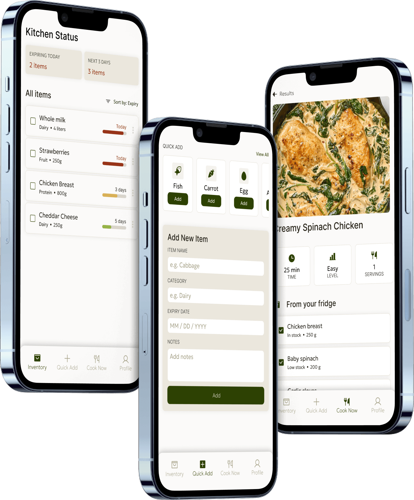
Through a competitor analysis of several direct and indirect food management tools, I evaluated how effectively each interface supported the "grocery-to-table" lifecycle. The analysis revealed a clear gap in the current landscape, as most tools tend to fall into three main categories:
- Specialized Trackers: Some tools focus purely on inventory or barcode scanning but lack actionable outcomes, such as recipe integration.
- Feature-Heavy Suites: Others offer a massive range of features, including social sharing and nutritional tracking, but suffer from steep learning curves and high-maintenance interfaces that lead to user abandonment.
- Basic Digital Notes: The remaining "tools" are simple lists (like Apple Notes) that are easy to use but provide zero proactive utility or automation regarding food spoilage.
This is where Fridge Friend lives. It fills the void for a tool that is as fast as a note-taking app but as smart as a professional inventory manager.
Outcomes of research
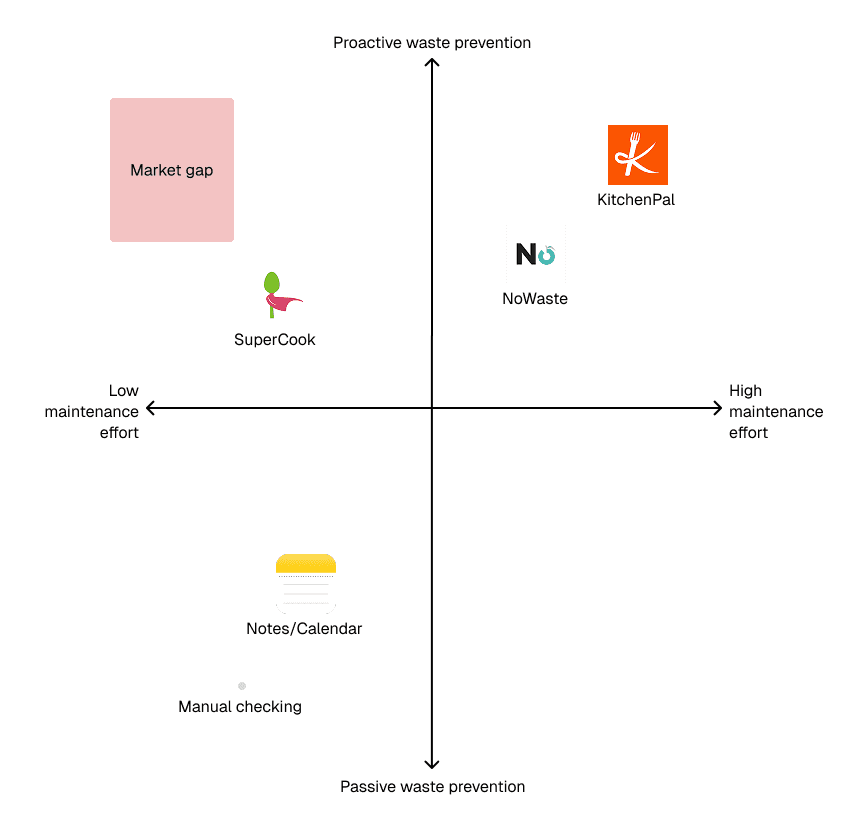
A key insight that emerged was that many users preferred basic, manual methods (like Apple Notes or physical lists) despite their lack of utility. Advanced kitchen management software was often perceived as intimidating, high-maintenance, or too time-consuming to navigate after a long day of classes.
At the same time, food management was revealed to be a highly interconnected process involving multiple shifting elements such as:
- Variable Expiry Dates: Different lifespans for produce, dairy, and proteins.
- Inventory Fragmentation: Tracking items hidden in the back of the fridge versus the pantry.
- External Inspiration: Referencing recipe blogs, YouTube tutorials, or family instructions.
- Financial Tracking: Keeping an eye on grocery spending and "price-per-meal" value.
Because these elements are currently managed across separate platforms, critical information frequently becomes fragmented. This leads to problems, where ingredients are forgotten until they spoil, resulting in consistent financial loss and unnecessary food waste.
Brainstorm
During the brainstorming phase, insights from user interviews revealed a recurring pattern in how students managed their groceries. Many had developed their own makeshift systems, such as sticking sticky notes on the fridge door with "use by" dates, or maintaining running lists in Apple Notes that they would manually cross-reference while shopping. These methods were effective to an extent and demonstrated a clear, urgent need for instant access to inventory status without having to physically open the fridge.
However, these manual solutions were not scalable. As the week progressed and schedules became more frantic, this became difficult to maintain. Users were required to:
- Constantly update multiple lists as they snacked or cooked.
- Manually search for recipes that matched their aging ingredients.
- Remember to check their notes before the food actually spoiled.
This made the process time-consuming and error-prone. In many cases, a single missed update led to a "forgotten" ingredient, resulting in avoidable waste and financial guilt.
In response, we explored ways to preserve the speed and flexibility of these user-created systems while automating the heavy lifting. This led to the development of the Smart Inventory Dashboard, which integrates a prioritized expiry list directly with a one-tap recipe generator. By automating the "countdown" and "what to cook" logic, the app removes the manual labor while keeping the user in total control of their kitchen.
The goal wasn't to change how students think about food, but to remove the friction between having an ingredient and knowing how to use it.
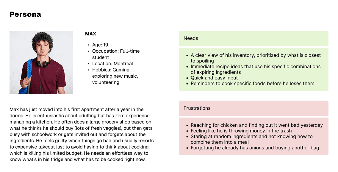
Some design decisions I've made during revisions
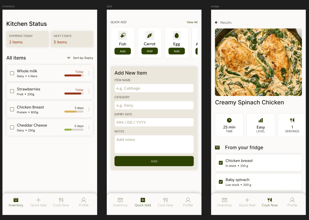
Initial iteration (top) vs. updated iteration (bottom):
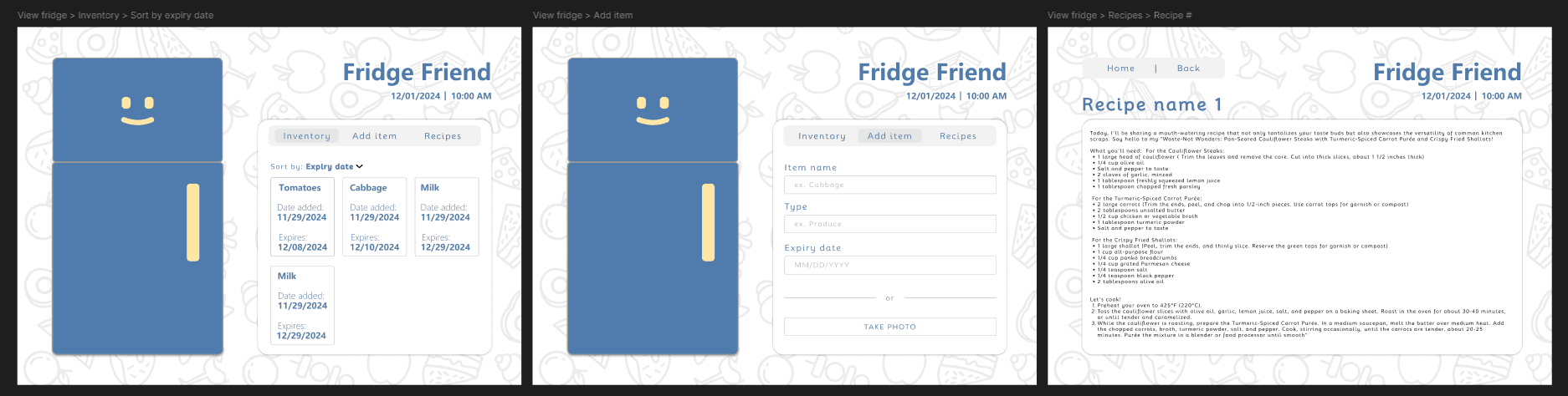
Mobile-First Architecture: Rebuilding the core interface as a native mobile application rather than a desktop web tool. Users are always on the move! I pivoted to mobile to support "in-the-moment" actions. Whether they are logging groceries while walking home from school or checking what's in the fridge while studying at the library, this move kills the friction of a desktop login and meets users exactly where they are.
Intentional Color Psychology: Transitioning from blue tones to an earth-toned, organic palette featuring sage greens and warm neutrals. I wanted the app to feel like an eco-friendly buddy, not a chore. The new colors reinforce our goal of cutting down food waste while keeping the vibe non-intimidating.
Scannable "Kitchen Status" Cards: Implementing high-level summary cards at the top of the dashboard. Using progressive disclosure, I surface the most urgent info first so that users know exactly what needs their attention before they start scrolling.
"Quick Add" Optimization: Integrating icon-based presets for high-frequency staples. I focused on slashing interaction time. Since most users buy the same dozen things every week, these one-tap buttons simplify the process.
From Passive Tracker to Active Solution: Developing the "Cook Now" bridge, which directly links fridge inventory to actionable recipes. By showing users exactly how to rescue soon-to-be expired items in their fridge, we close the gap between having food and actually eating it.
Challenges
Fridge Friend was born during an intense 36-hour hackathon, marking my first time ever using Figma. As the sole designer on a team of developers, I was responsible for the entire visual and structural direction of the app under an extreme time crunch. This required ruthless prioritization, as I had to focus entirely on the core onboarding and inventory engine while deprioritizing secondary features. Despite these constraints, we traded deep research for rapid, informal testing, ultimately delivering a functional MVP that solved the primary student need: reducing food waste and saving money.